
Create an Analytics view and add modules
Get access to the Analytics view
Reach out to our Customer Success team to add the Analytics view functionality to your Formant organization. You can reach us through the Intercom messenger in the bottom-right corner of this page, or at [email protected].
This guide will teach you how to add and configure an Analytics view to your device in Formant.
This guide describes the workflow to create a simple visualization using built-in query options. If you'd like to use a custom SQL query, or if you want to use our AI assistant to build more complex visualizations, see Custom SQL queries for Analytics.
Step 1: Create an Analytics view
- In Formant, in the upper-left corner, open the menu and select the device for which you want to view Analytics.
- In the header, click the right chevron >> Add View >> Report. This will add an Analytics view to your device.
- Give your new Analytics view a name and an optional description.
Step 2: Add a module
Click the Add (+) Module to add a module to your Analytics view. Each module in the Analytics view is an individual data visualization.
Step 3: Select a data source
Under Values, click Add.... You will see a searchable list of all streams, events, and task summaries associated with your device.
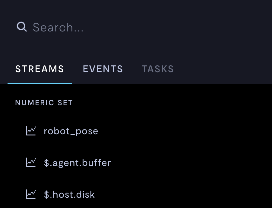
Selecting a data source for your Analytics module.
Select a data source for your visualization. If you want to add multiple data sources, you can click the Add... button again.
Task summaries
To visualize task summaries, you must first upload a task summary format, and then task summaries in that format, to Formant via the Task Summary API. For more information, see Task summaries.
Step 4: Group data and apply an aggregating function
- Data from your series is binned according to your Date Granularity setting. Choose a grouping for your x-axis.
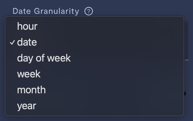
Choosing the size of your x-axis bins.
Available data groupings:
- Hour
- Date
- Day of week
- Week
- Month
- Year
- Click the data series you just selected in Step 3 to open the Aggregate window and apply an aggregating function to your data.
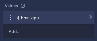
Click the data series you just selected to open the aggregation settings.
Available aggregating functions:
- Average
- Sum
- Count
- Minimum
- Maximum
Your data will be binned according to your choice of Date Granularity, and then the aggregating function will be applied to each bin individually. The result of this aggregating function will then be plotted in your visualization.
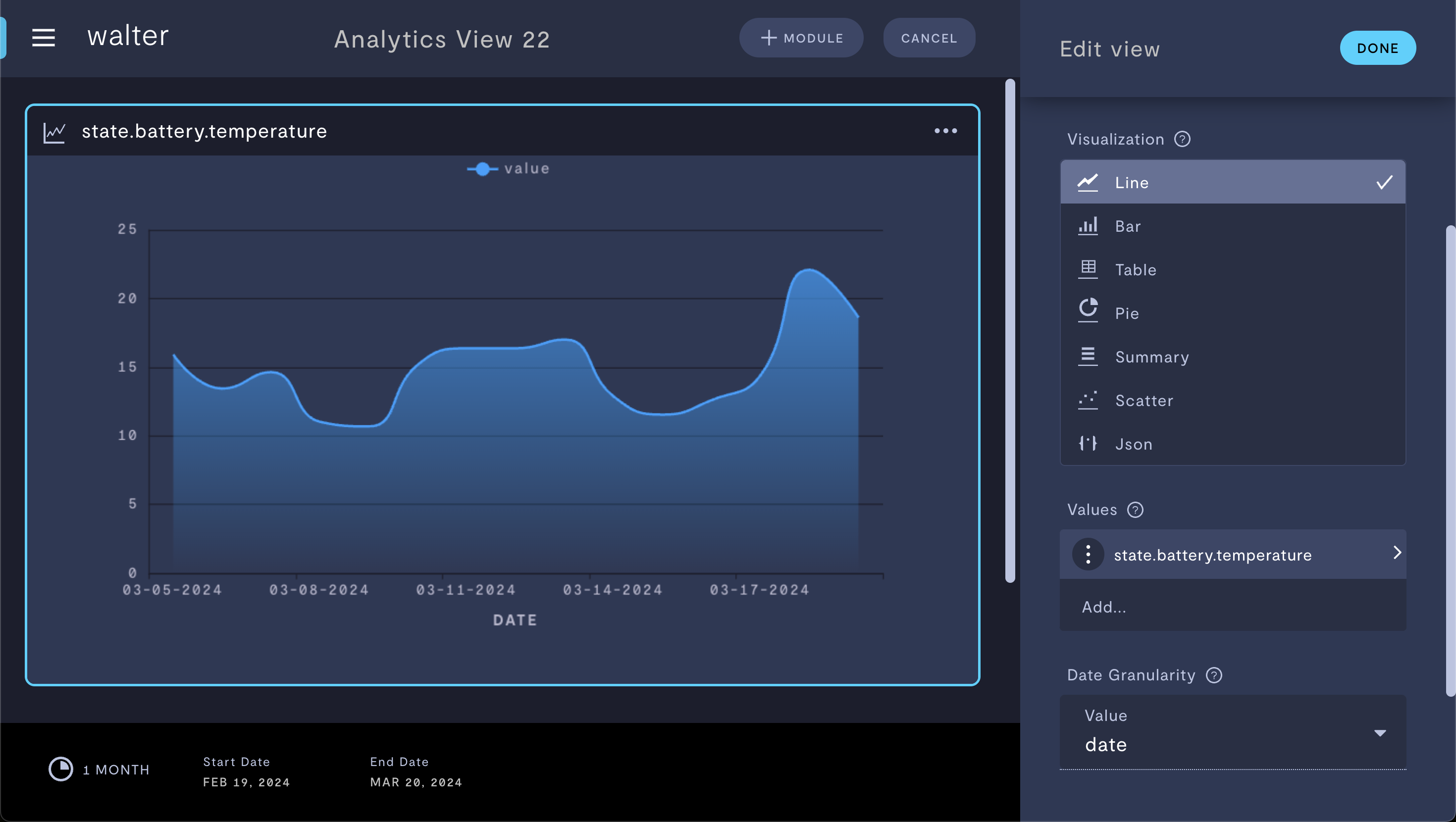
Step 5: Choose a visualization
Choose a visualization for your data series.
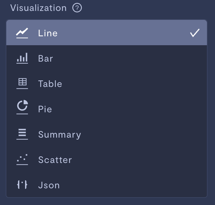
Visualization options.
Visualizations available:
- Line graph
- Bar graph
- Table
- Pie chart
- Summary
- Scatter plot
- JSON
After selecting a visualization, you will see your query:
Advanced settings
| Property | Usage |
|---|---|
| Fill date gaps | If ON, the x-axis of your visualization will show the entire time interval selected, whether data is present or not. If OFF, time intervals in your selection without data points will not be included in your visualization. |
Further advanced settings are documented in Custom SQL queries for Analytics.
If you notice an issue with this page or need help, please reach out to us! Use the 'Did this page help you?' buttons below, or get in contact with our Customer Success team via the Intercom messenger in the bottom-right corner of this page, or at [email protected].
Updated about 19 hours ago